Analyzing Your Process
Process Map
The Process Map is your visual window into how your process actually works. It's an interactive, node-based diagram that shows all activities, their connections, and detailed performance metrics. This is the heart of process mining.
Understanding the Process Map
The process map automatically visualizes your entire process flow by analyzing your event data. Instead of manually drawing flowcharts based on assumptions, you see the real process as it actually happens.
What You See
The process map shows:
- Nodes: Activities/events that occur (represented as boxes)
- Edges: Transitions between activities (represented as arrows)
- Metrics: Frequencies, durations, and performance statistics
- Paths: All the ways cases flow through your process
Example: Loan Application Process
In a typical loan process map, you might see:
- Application Submitted → Credit Check → Risk Assessment → Approval → Disbursement
But the map also reveals:
- Exception paths (rejection routes)
- Rework loops (resubmissions)
- Parallel activities (concurrent processing)
- Bottlenecks (where things slow down)
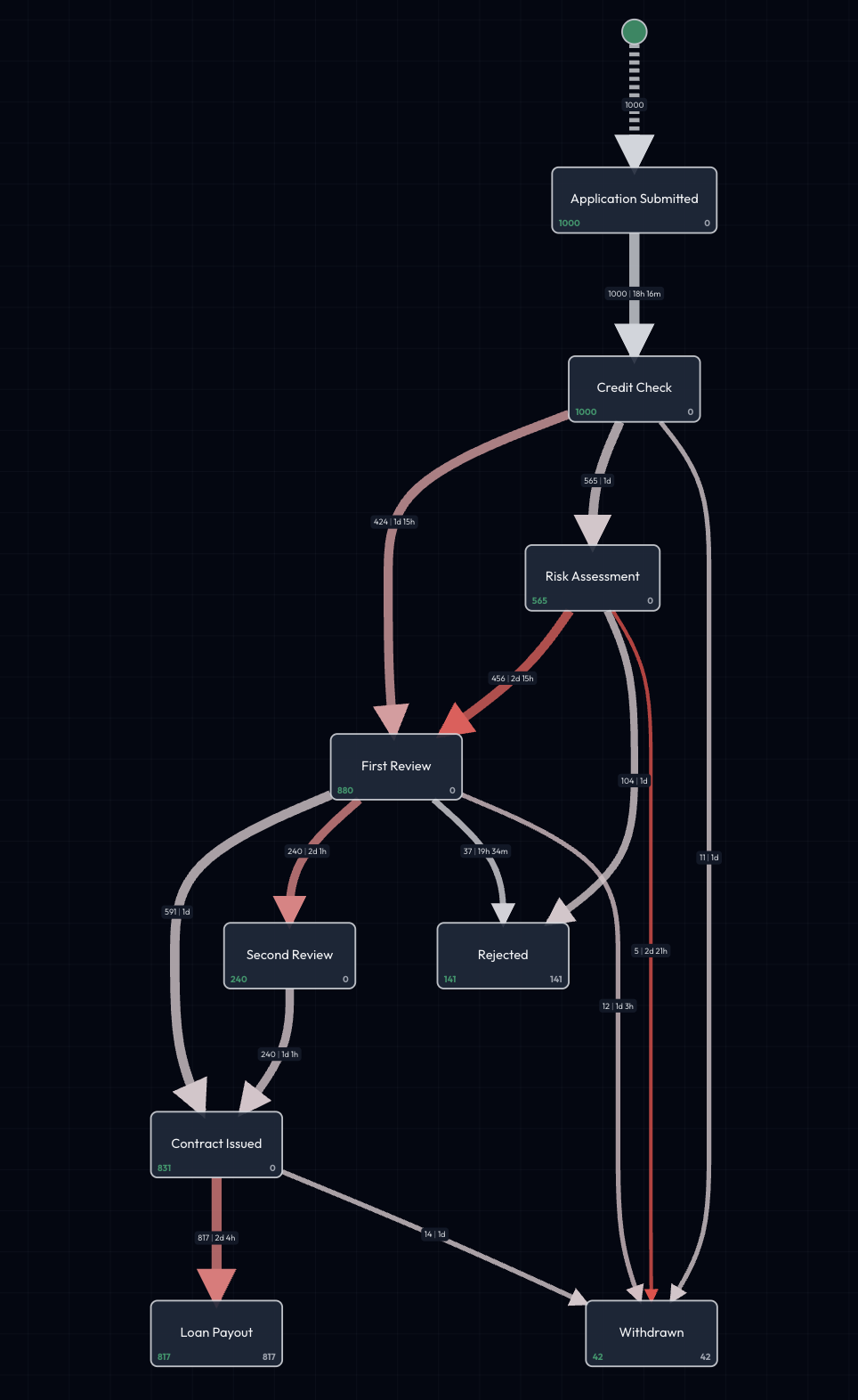
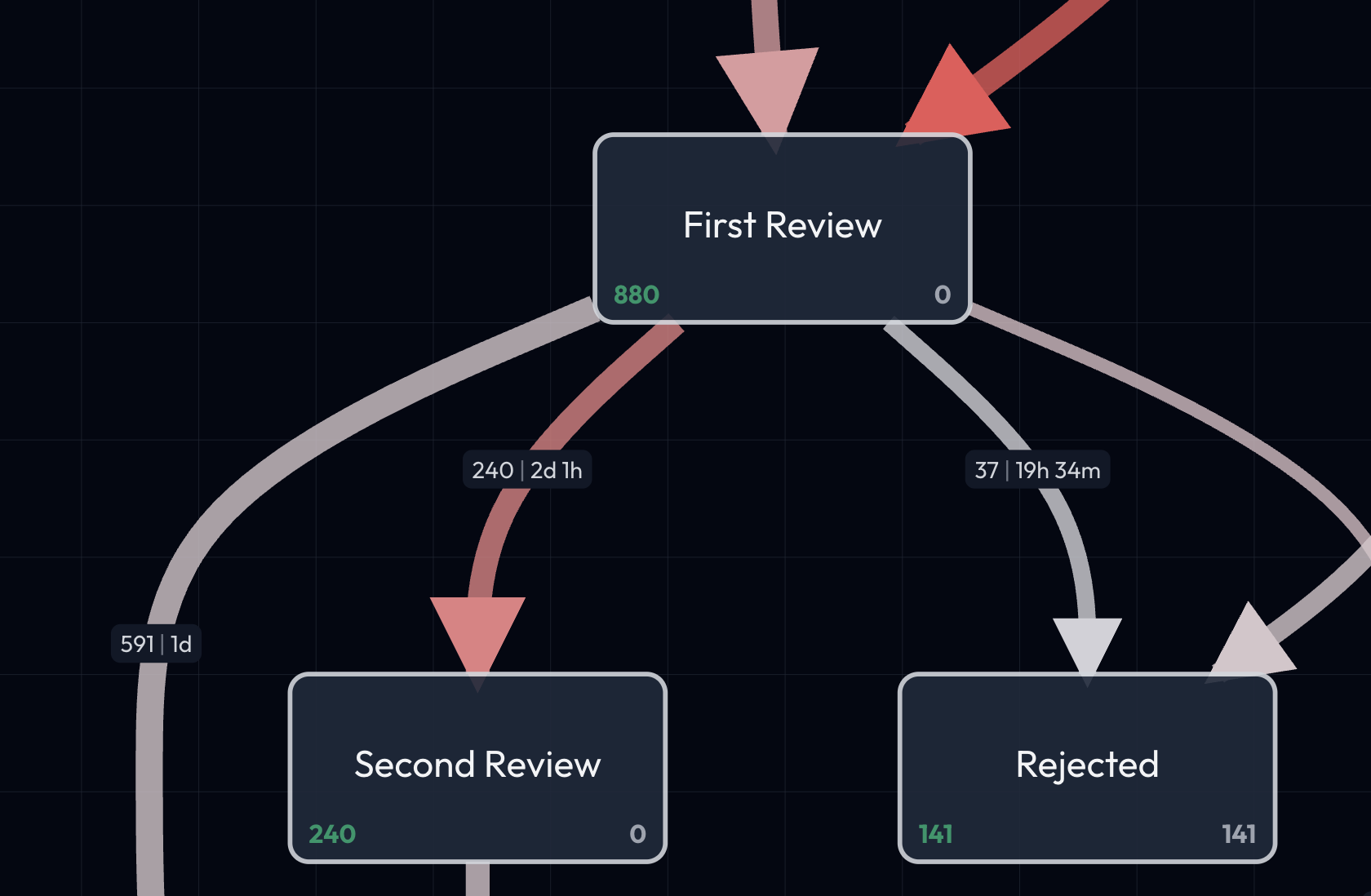
Reading Nodes and Edges
Understanding what nodes and edges represent:
Nodes (Activities)
Each node represents an event type - an activity that occurs in your process.
What nodes show:
- Activity name (e.g., "Credit Check Complete")
- Total cases that experienced this activity
- Percentage of all cases
- Position in the process flow
Example node:
Each node displays two key numbers:
- Green number (left): The count of objects that have entered and passed through this event
- Grey number (right): The count of objects currently waiting at this event—they reached this step but haven't moved to the next event yet (the process is still in progress for these cases)
This distinction helps you understand not just historical flow, but also where work is currently sitting in your process.
Node colors:
- Standard: Normal flow activities
- Start: Process entry points (typically darker/highlighted)
- End: Process completion points
- Selected: Currently selected for detailed view (highlighted in emerald)
Edges (Transitions)
Each edge represents a transition - when cases move from one activity to another.
What edges show:
- Direction of flow (arrow)
- Number of cases that took this path
- Percentage of cases from source node
- Average duration between activities
- Visual thickness (thicker = more frequent)
Example edge:
Credit Check → Risk Assessment
175 cases (75% of credit checks)
Avg: 1.5 days, Median: 1.2 days
Edge interpretation:
- Thick edges: Common paths (most cases follow)
- Thin edges: Rare transitions (exceptions)
- Back-pointing edges: Rework loops (cases going backwards)
- Multiple outgoing edges: Decision points (cases split to different paths)
Reading the Flow
Start at the beginning node (typically top-left) and follow the arrows. Thick edges show the "happy path" - the most common route through your process. Thin edges often reveal exceptions, rework, or special cases worth investigating.
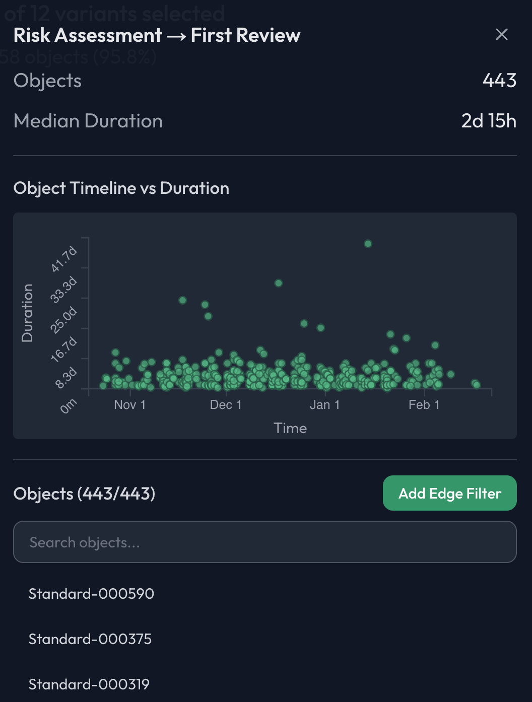
Duration Statistics
Edges display rich performance data to help you understand timing:
Key Metrics Explained
Mean (Average)
- Simple average of all durations
- Good for overall sense of timing
- Can be skewed by outliers
Median
- Middle value (50th percentile)
- Better representation of "typical" case
- Not affected by extreme outliers
P95 (95th Percentile)
- 95% of cases complete faster than this
- Identifies the slower cases
- Good for setting SLA targets
Min and Max
- Fastest and slowest observed cases
- Reveals range of variation
- Extremes may indicate issues or special handling
Standard Deviation
- Measure of variability
- High deviation = inconsistent timing
- Low deviation = predictable process
Example Duration Display
Application Submitted → Credit Check
─────────────────────────────────────
Cases: 250
Mean: 2.5 hours
Median: 1.8 hours
P95: 6.2 hours
Min: 15 minutes
Max: 2.3 days
Std Dev: 1.9 hours
What this tells you:
- Typical case (median): ~2 hours
- Some take much longer (max 2.3 days)
- High variability (std dev almost as large as mean)
- 5% of cases take over 6 hours
- Possible bottleneck worth investigating
Interactive Features
The process map is highly interactive, allowing you to explore in depth:
Zoom and Pan
Zoom Controls:
- Mouse wheel: Zoom in/out
- Zoom buttons: Click +/- controls
- Fit to view: Reset to see entire map
Pan Controls:
- Click and drag: Move the map around
- Helpful for large, complex process maps
- Navigate to specific areas of interest
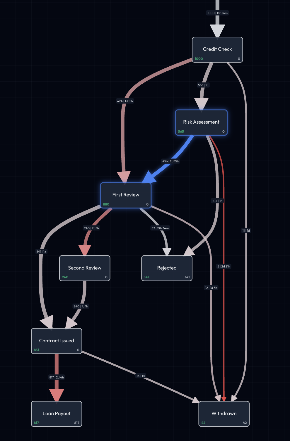
Selecting Nodes
Click any node to:
- Highlight it in emerald green
- Show detailed statistics in info panel
- See all incoming and outgoing edges
- View cases that went through this activity
Node details include:
- Total cases
- Percentage of all cases
- Average time spent in this activity
- Frequency of occurrence
Selecting Edges
Click any edge to:
- Highlight the transition
- Show duration statistics
- See case counts and percentages
- View transition frequency
Edge details include:
- All duration metrics (mean, median, P95, etc.)
- Number of cases
- Percentage from source node
- Performance indicators
Full-Screen Mode
Toggle full-screen to:
- Maximize map visibility
- Remove sidebar distractions
- Focus on process exploration
- Useful for presentations or complex maps
Pro Tip
Use full-screen mode when exploring complex processes with many activities. The extra screen real estate makes it much easier to see connections and patterns.
Identifying Bottlenecks
The process map helps you quickly spot performance issues:
Visual Indicators
Color Coding Edges are colored on a spectrum from grey to red based on duration:
- Grey edges: Fast transitions (shorter duration)
- Red edges: Slow transitions (longer duration, potential bottlenecks)
The redder an edge appears, the longer cases typically take to move through that transition.
Thickness
- Thick edges: High volume (many cases)
- Thin edges: Low volume (few cases)
What to Look For
1. Long Duration Edges Red or highlighted edges with high mean/median times:
Risk Assessment → Manager Approval
Mean: 4.2 days ← BOTTLENECK
Median: 3.8 days
P95: 8.1 days
2. High Variability Large standard deviation indicates inconsistent processing:
Document Verification → Final Decision
Mean: 2.1 days
Std Dev: 3.5 days ← INCONSISTENT
(Some very fast, some very slow)
3. Rework Loops Back-pointing edges showing repeated work:
Final Decision → Document Resubmit → Review
(Cases looping back for corrections)
```text
**4. Split Points with Delays**
Decision points where one path is much slower:
```text
Risk Assessment → Auto Approval (fast, 2 hours)
Risk Assessment → Manual Review (slow, 3 days) ← BOTTLENECK
Example: Finding Your Biggest Bottleneck
In our loan example, the map reveals:
- Risk Assessment → Manager Approval: 4.2 days average
- Document Verification → Final Decision: 3.1 days average
- Application → Credit Check: Only 2 hours average
Insight: Manager approval is the primary bottleneck, taking 2x longer than document verification and 50x longer than credit checks.
Using Filters
Filters let you drill down into specific scenarios:
Applying Filters
Filters narrow the process map to show only matching cases:
Example filters:
- "High-value loans only" (amount > $50,000)
- "Rejected applications" (ended at rejection node)
- "Cases over 14 days" (duration > 2 weeks)
- "Specific time period" (Q1 2024)
What changes:
- Node counts update (fewer cases)
- Edge frequencies adjust
- Duration statistics recalculate
- Some paths may disappear (if no matching cases)
Filter Impact
Before filter (all 250 loans):
Application → Credit Check: 250 cases, 2h avg
Credit Check → Approval: 175 cases, 1.5d avg
Credit Check → Rejection: 75 cases, 0.8d avg
After filter (high-value loans only, 80 cases):
Application → Credit Check: 80 cases, 2.1h avg
Credit Check → Approval: 65 cases, 2.3d avg ← Slower!
Credit Check → Rejection: 15 cases, 1.2d avg
Insight: High-value loans take longer to approve (2.3 days vs. 1.5 days overall)
Combining Multiple Filters
Filters combine using AND logic:
- Filter 1: "High-value loans"
- Filter 2: "Longer than 14 days"
- Result: High-value loans that took over 2 weeks
The process map updates in real-time as you add or remove filters.
Learn more: Filters & Exploration
Common Patterns to Recognize
Happy Path
The thickest edges forming a clear route:
Start → Step1 → Step2 → Step3 → End
(Most cases follow this standard route)
Exception Handling
Thin edges branching off to error handling:
Step2 → Exception Handler → Recovery → Step3
(Rare but important error paths)
Rework Loops
Edges pointing backwards:
Review → Rejected → Resubmit → Review
(Cases going in circles)
Parallel Paths
Multiple edges leaving a node:
Received → Path A (fast track)
        → Path B (standard)
        → Path C (complex review)
Skipped Steps
Missing edges you'd expect to see:
Expected: A → B → C
Actual: A → C (B was skipped)
Best Practices
First-Time Exploration
- Start with full view: See the entire process
- Identify start and end: Understand entry/exit points
- Follow thick edges: Find the happy path
- Look for red edges: Spot bottlenecks
- Check rework loops: Find inefficiencies
Regular Monitoring
- Weekly review: Check for new bottlenecks
- Compare periods: This week vs. last week
- Monitor metrics: Are durations increasing?
- Track changes: Did process improvements help?
Presentation Tips
- Use full-screen mode: Maximum visibility
- Zoom to problem areas: Focus attention
- Use filters to compare: Show before/after
- Highlight specific paths: Tell the story clearly
Next Steps
Now that you understand the process map, explore other analysis tools:
Analyze Variants
- Process Variants - See different execution paths through your process
Get AI Insights
- AI-Generated Insights - Let AI identify opportunities
- AI Co-Pilot - Ask questions about your process
Advanced Exploration
- Filters & Exploration - Drill down with advanced filtering
Explore Your Process
The process map is your window into reality. It shows you exactly how your process works, not how you think it works. Spend time exploring, clicking nodes and edges, and discovering patterns. Every bottleneck you find is an opportunity for improvement.